
Responsive Design vs. Mobile-First
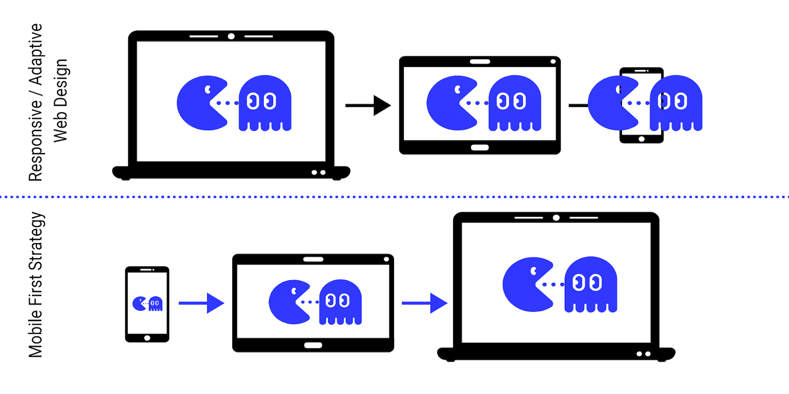
I have heard some people speak of "mobile-first" and "responsive design" interchangeably making them sound as if they were one and the same. However I think there are some subtle differences. I believe responsive design is the broadest possible definition. It says to me that we are going to target all platforms, screen sizes, pixel densities, etc. It means that the user experience will be custom tailored to the exact device you just happen to be viewing it with. This should be our ultimate goal, right?
"Mobile-first" is a narrower definition and implies that the majority of the design effort is going to be geared towards the mobile experience. But there are a lot of other things it doesn't clarify such as:
- Definition of "Mobile" - aren't smartphones, tablets and laptops all mobile? Do we really mean "Smartphone-first"?
- "Mobile Only" vs "Mobile First" - what will the support level be on "non-mobile" devices?
The second point is interesting because the the first wave of responsive design was focused on taking websites designed for a large screen and simplifying and stripping them down so they would "fit" and work well on a phone.
If we now start with a "mobile-first" design how should we add to it to create the desktop experience? It seems easier to start with something a little more complex and then simplify it rather than start with something simple and try to add complexity to it. Said another way if you distilled your site to work great on a smartphone then what are you going to add back? That's one of the tough aspects of responsive design.
When people first started using the term mobile-first I think some meant that instead of starting with a desktop design and then progressively degrading it to work on smaller and smaller screens we should start with a highly optimized mobile site and then progressively enhance it for larger screens. This model makes sense as long as we are actually thinking about, and designing for, all screen sizes.
Side note: One of the best aspects of mobile design is the performance tuning required to make a site run well on a smartphone because it pays speed dividends on every device, everywhere.
I believe in the mobile-first progressive enhancement approach but I'd still rather say we doing responsive design over mobile-first because to me it says we are going make our site work great everywhere, for everyone.